Co-founder, Lead Designer at flagtag
A fun and competitive mobile platform where users capture flags for local deals and glory.
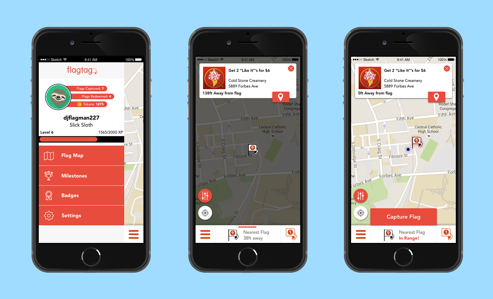
Final App screenshots of the flag redemption process

Flagtag is a mobile platform where users capture nearby virtual flags linked to local deals from businesses. Think Pokemon Go, but instead of Pokemon you capture real deals in competition with people in your area.
This was a startup I founded with four other co-founders. We were accepted and participated in AlphaLab (2015 Winter cohort), a nationally ranked software accelerator, and raised seed funding.
See High Fidelity Prototype at http://mny3xs.axshare.com/iphone_frame_for_desktop_view.html
The Problem
For our pilot launch, redesign a mobile experience that supports a user to discover virtual flags, physically capture flags and redeem their deal at a local business.
The Process
To redesign flagtag I user tested a design in various fidelity levels. For each level I performed iterative tests focused on three main interactions within the application: browsing flags, capturing flags, and redeeming flags.
Low Fidelity
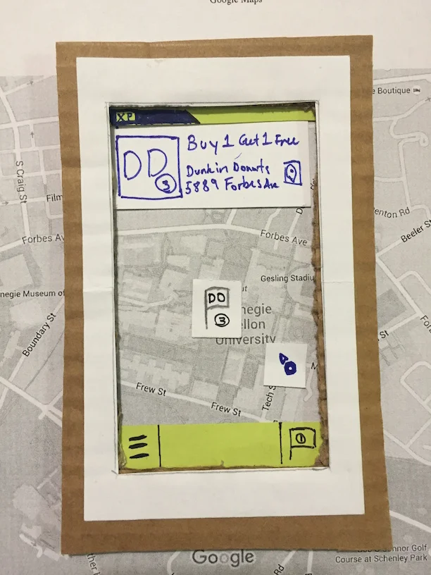
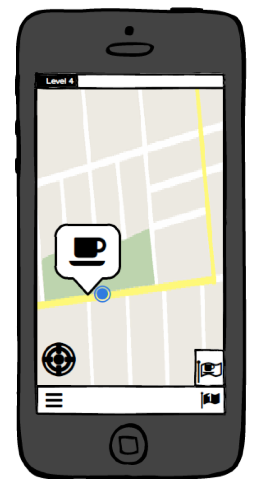
To quickly prototype my application I used cardboard and paper. In order to simulate a mapping interface, I printed out a picture of google maps and used a cardboard cutout to simulate the user “moving” to different locations with the application.
Some of the biggest feedback I got was about feedback and consistency. My users weren’t sure about actions happening in the application because changes were too small. Also, users had trouble finding buttons on the application because their area of interaction was not consistent.
Using paper really helped me prototype in a quick and unlimited fashion. Using paper allowed me to create anything I imagined. In testing users focused on overall navigation issues, and actual concepts and features of the application.
Medium Fidelity
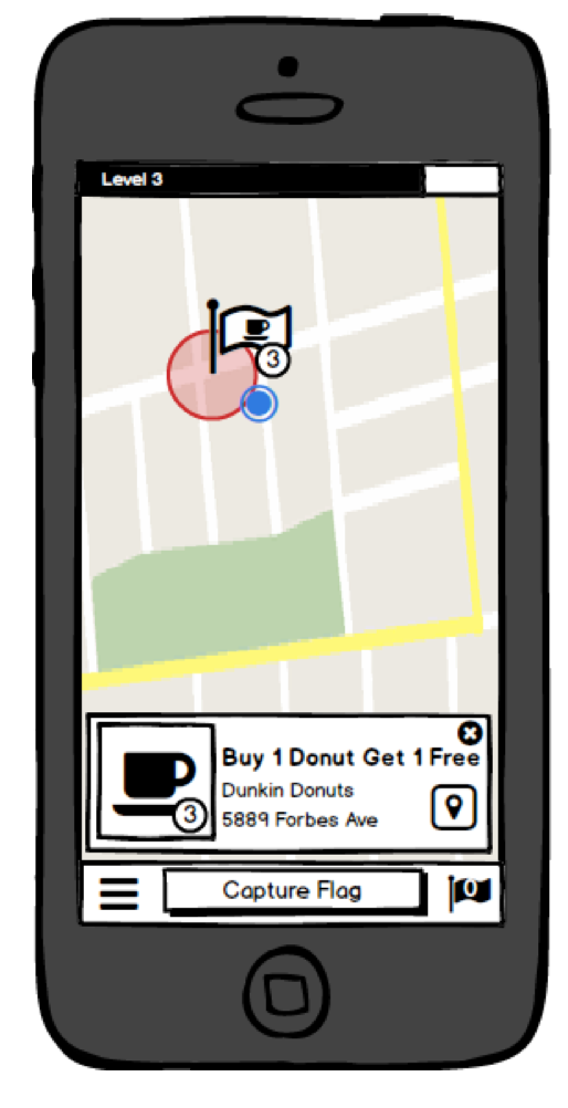
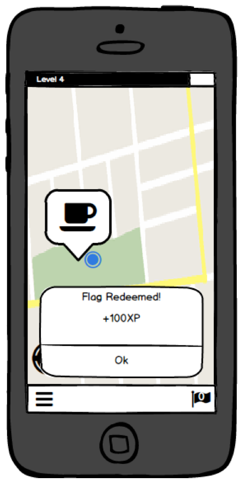
For my medium level of fidelity I used Balsamiq, this allowed me to quickly prototype digitally and add interactivity.
I got a lot of good feedback to improve application feedback. This includes using animations to show actions more clear, and more visual elements- like circles and labels that show when a user comes near a flag.
Using Balsamiq allowed me to prototype must faster than before, and do things like link between pages. Testing with people went much smoother and subjects were able to have better “belief” of the application.
High Fidelity

In my high fidelity prototype I decided to use Axure. This choice was made because I wanted to learn this application. Additionally, I wanted to easily implement a mapping feature for user testing, which I was able to by creating a draggable map image.
I received a lot of detailed feedback about my visual design and interaction. Specifically, I was told to make my “redeem” and “capture” buttons larger, allowing users on the move the ability to press them easier. Beyond this I received feedback that my redemption process was awkward and not intuitive. This shed light on the difference between fidelities, as I had never received this feedback previously. I hypothesize that interacting with my low fidelity was awkward already, so users did not catch on to this problem. I will need to spend more time prototyping and testing this specific interaction in the application.
In terms of positive feedback, users liked the animations of capturing a flag, this was positive as previous tests reported that it was hard to know when they captured a flag. This tells much about the affordance of high fidelity prototypes, I was able to test interactions like animations, user movement, and transitions much better than in past fidelities. That being said, trade-offs exist as the process was more time consuming to create.
Conclusion
After implementing the new flag discovery and redemption flow in our pilot test, we reached a 90% flag capture rate and a 28% flag redemption rate. The 28% flag redemption rate is 4 times the standard rate in which online deals are usually redeemed after an impression.

